Wednesday, 19 December 2012

Symbols and actions

This week we were given actions we had to convert into symbols that represented that action as simply as possible. My action was 'combing your hair' so I started looking at how the hair changes from combing it, and what the actual action of running a comb through your hair would look like.
These are the final 80 I designed. I decided to do them in sequences of four to represent the actions and change the hair undertakes more accurately.


The beginning

I start the foundation course at Leeds College of Art this week. I'm pretty excited to move on from my A levels and see what different styles of work I can produce, but I'm nervous about going somewhere I don't know anyone!
Being at the same school for 7 years means I'm more than ready for a change! But I'm not looking forward to staying in Leeds while all my friends go off to uni.
I will try to regularly post my work on this blog so I can assess my outcomes. Hope whoever sees this enjoys it!

Making grids

Another project from my foundation course, the idea was to merge four different corners of a grid to create a flowing pattern. This is about halfway through, I am quite pleased with it so far but wish I'd used an easier material to cut. Felt is mean.

Drawing

I did this sketch for one of my best friends who's going to uni next week, she asked if I could do her something she could take and this is what I produced!
I really enjoyed trying to get all the details right on our faces and overall am really pleased with the picture as you can tell it's us.

Wednesday, 23 May 2012

Final exam piece


This is the outcome of all my prep work. I think the 3 pictures worked well together, and am pleased with the final result because of the colours. I don't feel as though they are as detailed as my prep work which I was diappointed with, but given the time limit I am happy with the result.

Thursday, 10 May 2012

Michael Roberts copies


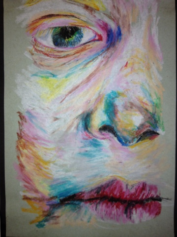
I was captivated by the work of Michael Roberts because of the way the close up face makes the viewer feel uncomfortable. The square canvas makes the face looked confined because it contrasts the usual roundness of a face. My copy (left) is done in oil pastel, and was just a quick study to try and convey as similar feeling of unease.

Sunday, 6 May 2012

Exam prep

This is a painting I did on board to practise doing 3 figures together before my exam.

Saturday, 5 May 2012

Father and son


My etchings depicting a father and son relationship are shown above, and I have experimented with adding brusho, pencil and light and dark shading to create different atmoshpheres.
Below is a biro drawing I did of the same picture, as I felt the medium worked well withy some pictures form my coursework.

Thursday, 3 May 2012

Face painting

Just a couple of prep paintings I did in oil paint to try using different colours. In the face above on the left I have used greens, blue and yellow to make up the different sections of the face, to imitate the work of Lucian Freud. I have also done a copy of a Freud picture below.

Saturday, 21 April 2012

Faces


To start my exam, I took these pictures of faces, so I could attempt to paint/draw them in the style of Michael Roberts and Lucian Freud.

Wednesday, 18 April 2012

Final coursework outcome


From the pictures I took and the prep work I have done, this is the final coursework outcome I produced based on the body. It is mainly a study of colour and light, completed in oils, and i have done the background in a plain wash to bring the point of focus to the figures in the same way as Nigel Cox.
It also means they could be anywhere, and therefore lets the viewer place the figures in their own environment. As they are doing seemingly private things however the viewer may also feel as though they are intruding, and the bright colour of the pink jumper against the background contrasts to the quiet action of playing as it is a bold colour.

Friday, 13 April 2012

Biro drawings

I proceeded to do some biro drawings from the pictures i took of figures, just to see what they looked like in a different medium.

The girl with the umbrella, to the left, is a Nigel Cox copy, which I did in biro to link in with my own photos.

Wednesday, 11 April 2012

Figure photos


For a project we did on the body these are the pictures I took. They are based on the work of a contemporary artist I found called Nigel Cox, who like Hopper uses detailed figures in his work, who appears to be concerned with something the viewer has to guess at. Unlike Hopper however Cox paints the backgrounds as vast, plain lanscapes that represent lanscapes in the artic, which has the effect of really highlighting the detail in the figures he paints. I hoped to mimick this is my photos, aiming to capture people in the middle of doing something seemingly private but the blank background means they could be anywhere.

Conroy study

Another artist copy, in oil again, but experimenting with different colours and a slightly more intriguing content, compared to the single figures of Hopper's work.

Sunday, 4 March 2012

More copies

This is a copy I did of Hopper's work, after doing a small study of his work in my personal study. I like the way it makes the viewer wonder what has happened to the woman in the picture, as she is alone in an impersonal room, but seems wrapped up in her thoughts. I did this picutre in oil paint on canvas paper, which I find the easiest medium to work with, as oil is malleable and allows me to create subtle tones not available with acrylic.

Etchings


I continued to do some etchings from the pictures of Catherine I took. Although the face didnt work so well, due to the fact it is etched to darkly under the eye, I think the shirt and the flowers draw the viewers eye away from it. I am pleased with the flowers because they add interest to the picture and balance out the large figure on the left hand side.
I think if I were to do these etchings again I wouldnt put any shading into the face, and would add depth with the oil instead.
I then experiemented with a couple of the etchings that hadn't worked so well. I added brusho to the top one, and then drew into it with a blur biro to highlight the darker areas and create more contrast.
The second picture has been drawn into with pencil, but rather than shade everything, I have gone round the outlines to set certain parts of the picture further back, in order to create a more 3D looking picture.